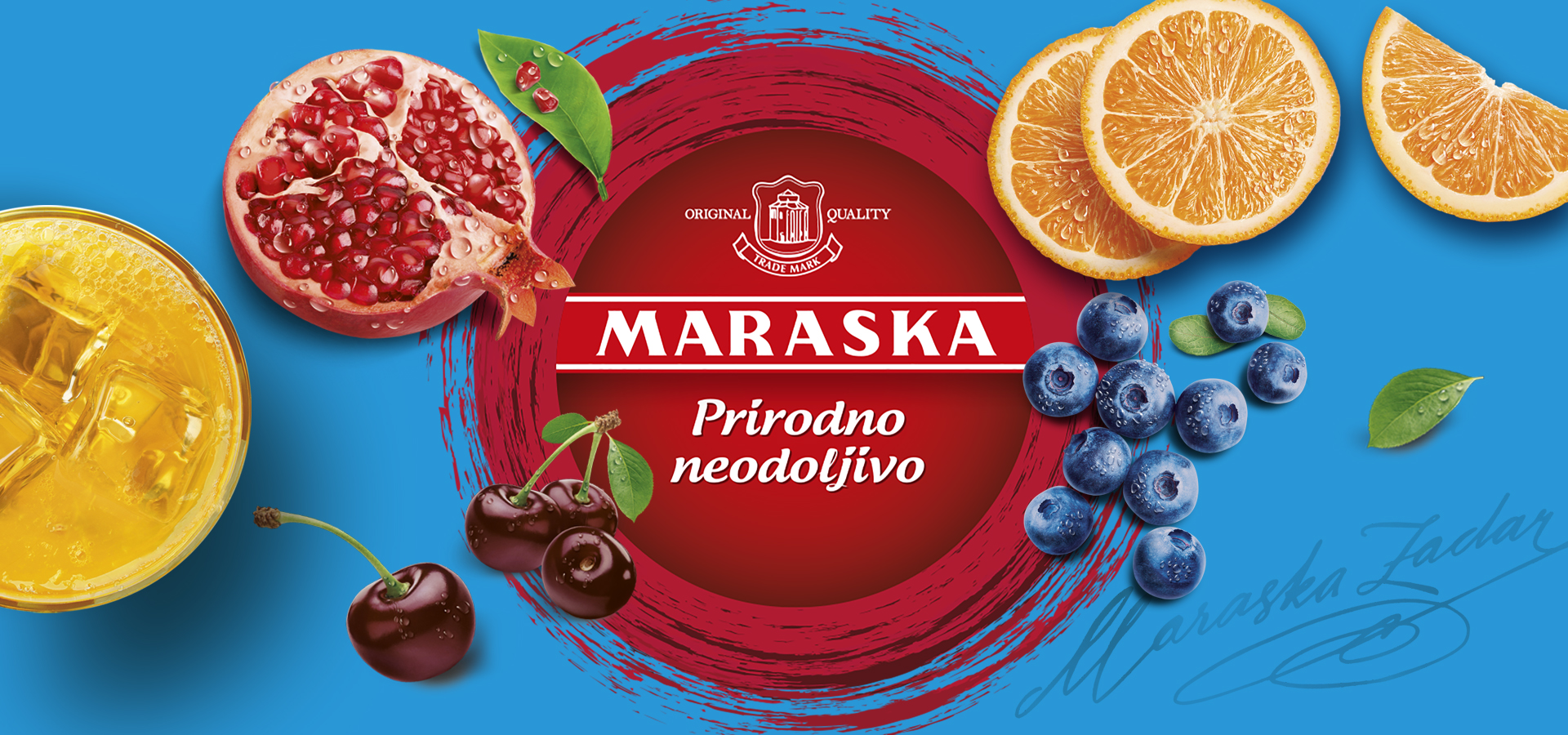
MARASKA
Customer
MEPAS GROUP
CATEGORY
packaging, photography, branding
PROJECT
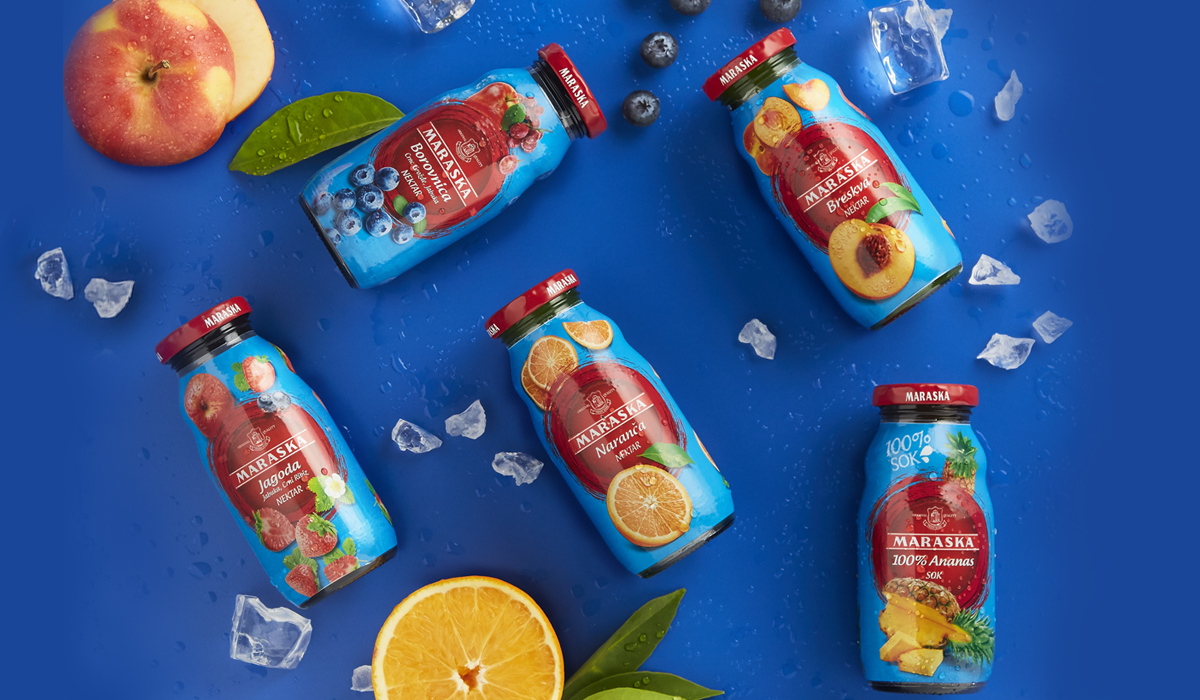
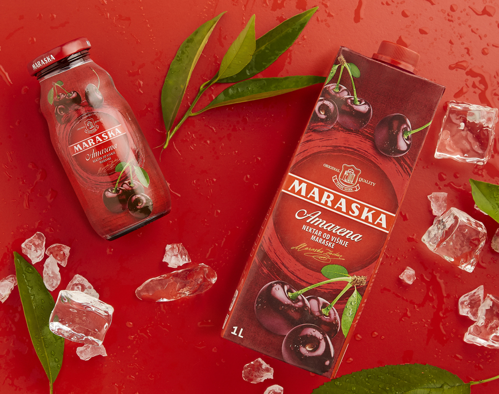
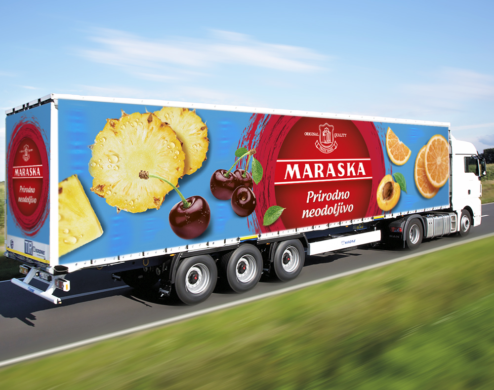
Maraska, historical Croatian brand distributed throughout the Balkan region, has commissioned Locanda Design to redesign the entire product portfolio. The new identity, without compromising the product recognizability, should have expressed in a modern key the values and the distinctive codes of this brand that represents for the different generations of its consumers not only an excellent product but also an emotional reference. The new identity also had to consider two distinct design developments: the first dedicated to the historical Amarena line and the second one for the remaining flavours.
LOCANDA'S RECIPE
Our main focus was to define a product identity that could generate, on the shelf, an immediate and distinctive recognition of the product offer. The category of fruit drinks represents all the colors that the human eye can perceive. For this reason we opted for a central brand block of round shape that's consistently repeated, as a strong signal, on the whole products range and a choice of two colors which were already recognized and stratified, over the years, in consumers' minds: respectively bordeaux for Amarena and cyan for the others flavours. The refinement and the colors of the photo-illustrations then attributed taste and freshness to the whole line.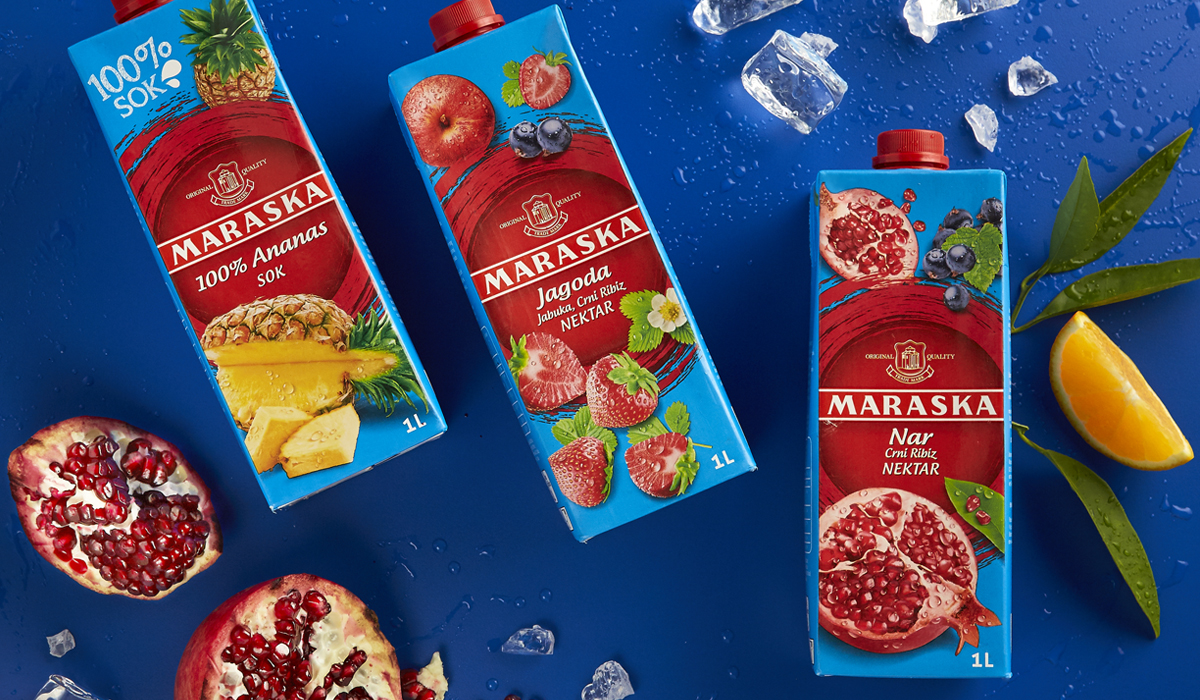
OTHER PROJECTS