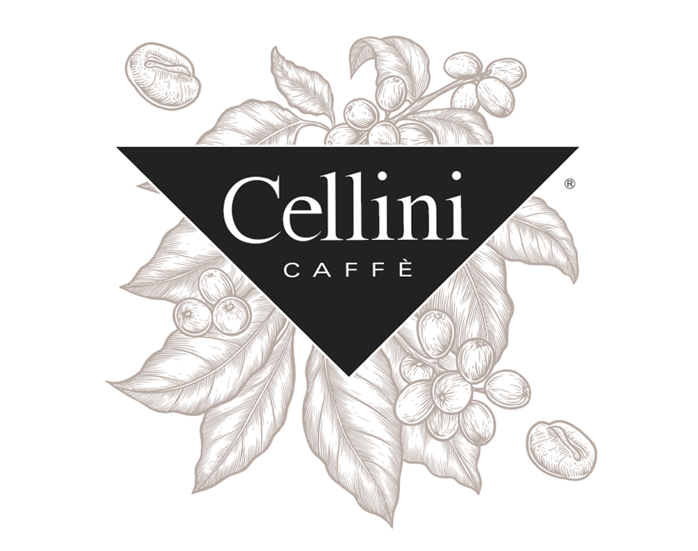
CELLINI CAFFE'
Customer
CELLINI
CATEGORY
packaging
PROJECT
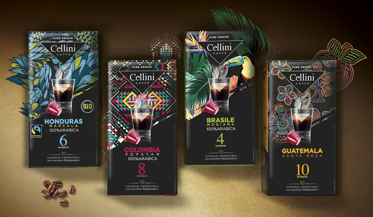
Cellini is a quality reference in the coffee market both in Italy and abroad. Its history of Italian family business still characterizes the company, its way of being and its product. A maniacal attention from the selection of the raw material to the coffee roasting and the packaging of the product. For this reason, Locanda Design has been asked to update the visual identity of the coffee capsules (Nespresso® compatible) to the new aesthetic standards but always respecting the company's founding values. The design development has concerned two aspects: the standard line and the one of the mixtures coming from particular geographical areas (pure origins).LOCANDA'S RECIPE
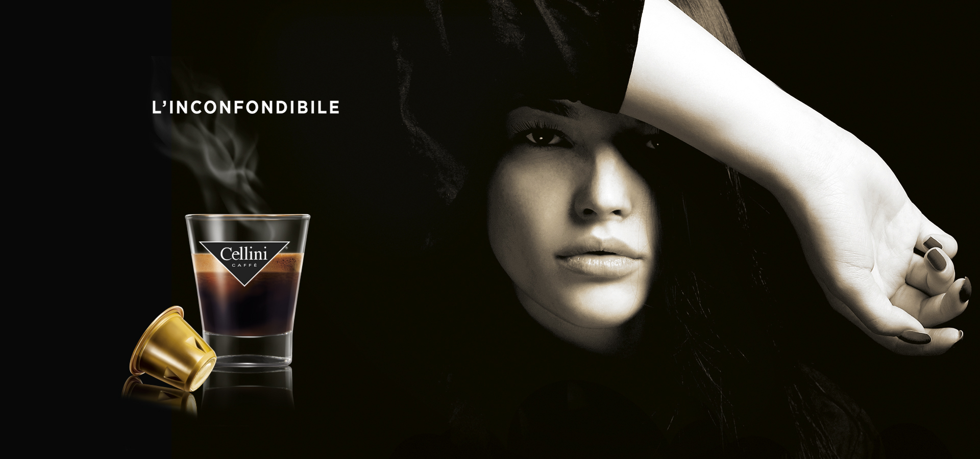
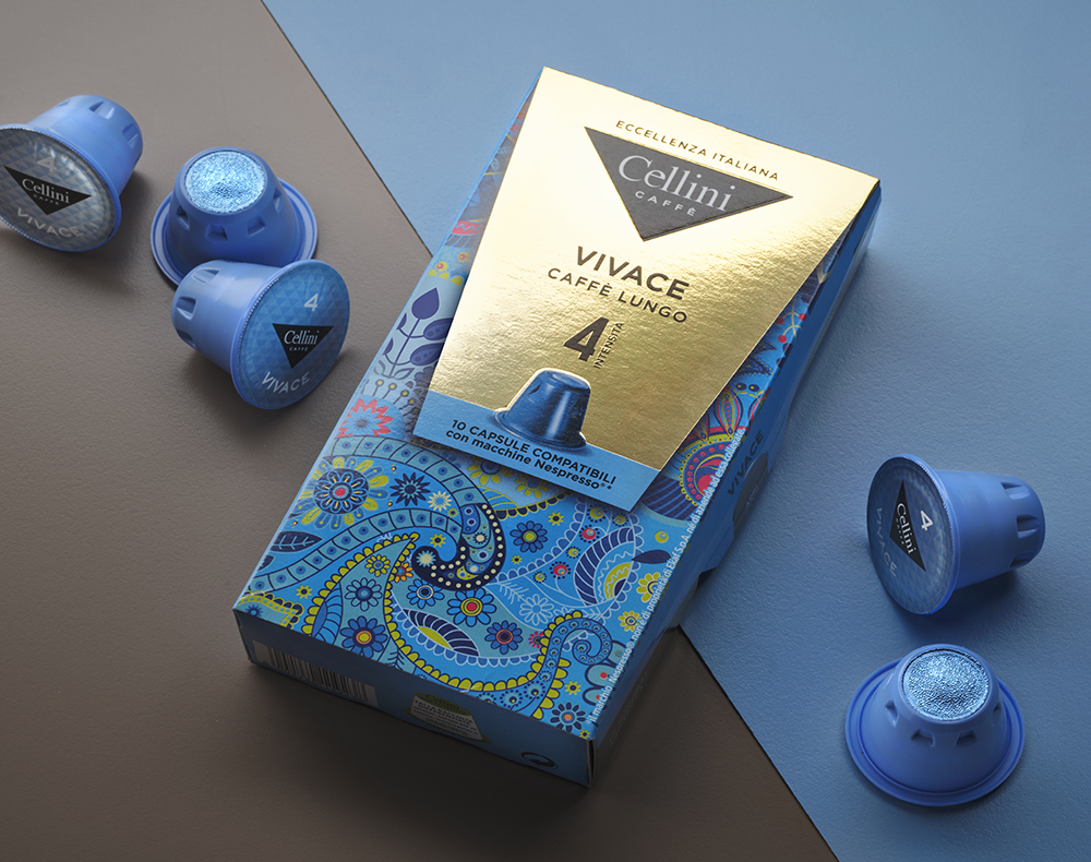
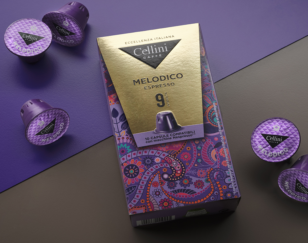
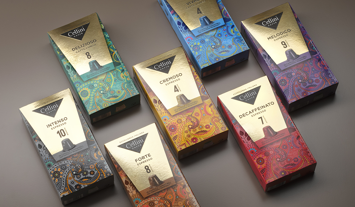
The new identity provides the primary role of the Cellini brand, which, with its characteristic triangle shape, introduces a tasty and engaging representation of a cup of coffee that releases all its aroma emphasized by the contrast between the smoke and the institutional black background. The variety of taste is entrusted to the color of each single reference. A sequence of sophisticated colors, characterized by a background texture that recalls the finish of the textured leather, make the entire range not only elegant but clearly visible at the point of sale both on the shelf and out of shelf. For the Pure Origini line, on the other hand, we have created a texture capable of synthesizing the iconography of each individual geography and of narrating through images the characteristics and the notes of each single variety.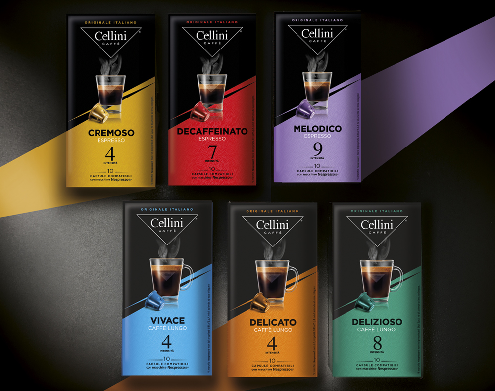
OTHER PROJECTS